为 WordPress 网站添加移动端底部导航菜单,可以显著提升移动用户的浏览体验。以下是一个经过优化和修正的实现方案,适用于现代 WordPress 主题。
一、添加 CSS 样式
在主题的 style.css 文件末尾添加以下样式代码。这段代码定义了底部导航栏的布局、外观和图标。
.mobile-bar {
    position: fixed;
    bottom: 0;
    left: 0;
    right: 0;
    background: #FFF;
    z-index: 9999;
    border-top: 1px solid #e0e0e0;
    width: 100%;
    display: flex;
    justify-content: space-around;
    align-items: center;
    box-shadow: 0 -2px 10px rgba(0, 0, 0, 0.1);
    padding: 8px 0;
    box-sizing: border-box;
}
.mobile-bar a {
    cursor: pointer;
    color: #5D656B;
    display: flex;
    flex-direction: column;
    align-items: center;
    text-decoration: none;
    flex: 1;
    transition: color 0.3s ease;
}
.mobile-bar a:hover {
    color: #0073aa;
}
.mobile-bar a i {
    display: block;
    width: 24px;
    height: 24px;
    margin-bottom: 4px;
    background-size: contain;
    background-repeat: no-repeat;
    background-position: center;
}
.mobile-bar a span {
    display: block;
    color: #333;
    font-size: 12px;
    line-height: 1.2;
}
/* 图标定义 - 请替换为你的图标路径或使用字体图标 */
a.i-home i {
    background-image: url('data:image/svg+xml;utf8,');
}
a.i-cat i {
    background-image: url('data:image/svg+xml;utf8,');
}
a.i-my i {
    background-image: url('data:image/svg+xml;utf8,');
}
a.i-buy i {
    background-image: url('data:image/svg+xml;utf8,');
}
/* 高亮按钮样式示例 */
a.i-buy span {
    color: #fff;
    background-color: #ff5e5c;
    padding: 4px 8px;
    border-radius: 12px;
    margin-top: 2px;
}
二、添加 HTML 结构
将以下代码添加到主题的 footer.php 文件中,位置在 </body> 标签之前。我们使用条件判断确保导航只在移动端且非文章详情页显示。
<?php if ( wp_is_mobile() && ! is_single() ) : ?>
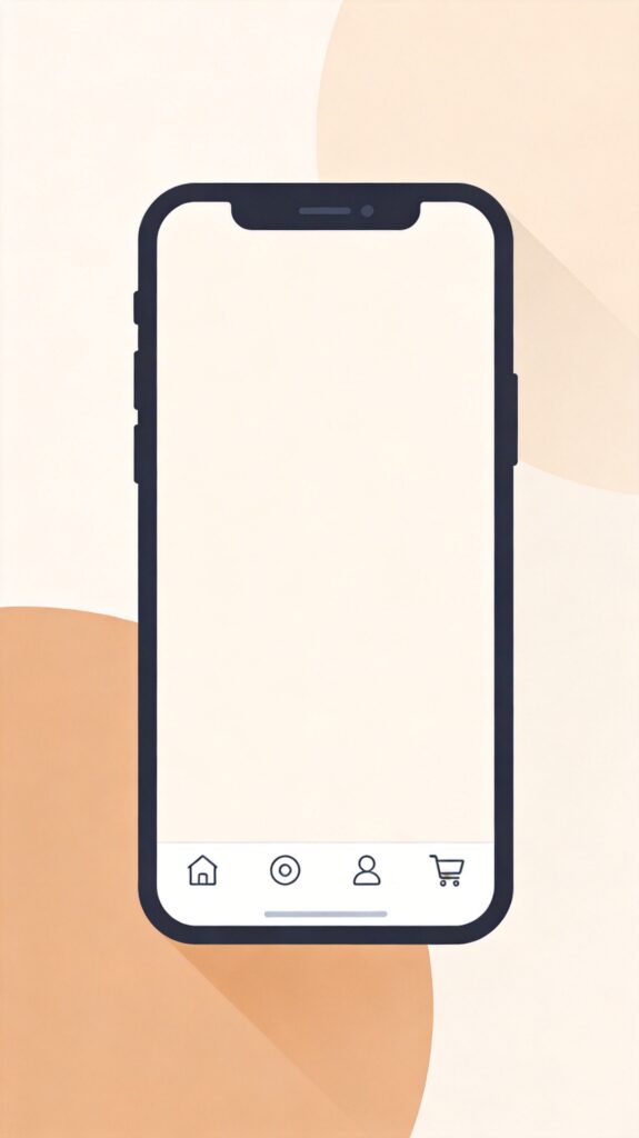
<div class="mobile-bar">
<a class="i-home" href="<?php echo esc_url( home_url( '/' ) ); ?>"><i></i><span>首页</span></a>
<a class="i-cat" href="<?php echo esc_url( get_permalink( get_option( 'page_for_posts' ) ) ); ?>"><i></i><span>分类</span></a>
<a class="i-my" href="<?php echo esc_url( get_author_posts_url( get_current_user_id() ) ); ?>"><i></i><span>我的</span></a>
<a class="i-buy" href="<?php echo esc_url( wc_get_page_permalink( 'shop' ) ); ?>"><i></i><span>商城</span></a>
</div>
<?php endif; ?>三、配置与自定义说明
1. 修改菜单项
- 文本:直接修改每个
<a>标签内<span>中的文字,如“首页”、“分类”。 - 链接:修改每个
<a>标签的href属性值。示例中使用了 WordPress 函数动态获取链接,你也可以替换为静态 URL,例如href="https://yourdomain.com/about/"。 - 图标:CSS 中通过
background-image定义图标。示例使用了内联 SVG,你可以替换为你的图标文件路径(如url('/wp-content/themes/your-theme/images/icon-home.png'))或使用字体图标库(如 Font Awesome)。
2. 高级调整
- 显示条件:代码中的
if ( wp_is_mobile() && ! is_single() )表示仅在移动设备且非文章单页显示。你可以修改此条件,例如移除&& ! is_single()以在所有页面显示,或增加其他条件。 - 样式微调:通过修改 CSS 中的颜色、阴影、圆角、间距等属性,可以使导航栏完全匹配你的网站设计风格。
- 性能优化:建议将图标整合为雪碧图(Sprite)或使用字体图标,以减少 HTTP 请求。
注意:在修改主题文件前,请务必创建子主题或进行备份,以防止主题更新时丢失自定义代码。对于更复杂的需求,建议将代码封装为插件或使用主题提供的自定义菜单功能。